
People walk past dozens of screens, posters and notices every day. Most of them barely register. A good screen gets noticed because it is clear, timely and placed where someone is already looking.
This article walks through practical examples of digital signage, explains why each one works, and ends with a short checklist you can use for your own screens. If you are looking for a quick digital signage example to copy, start with the sections below that match your business.
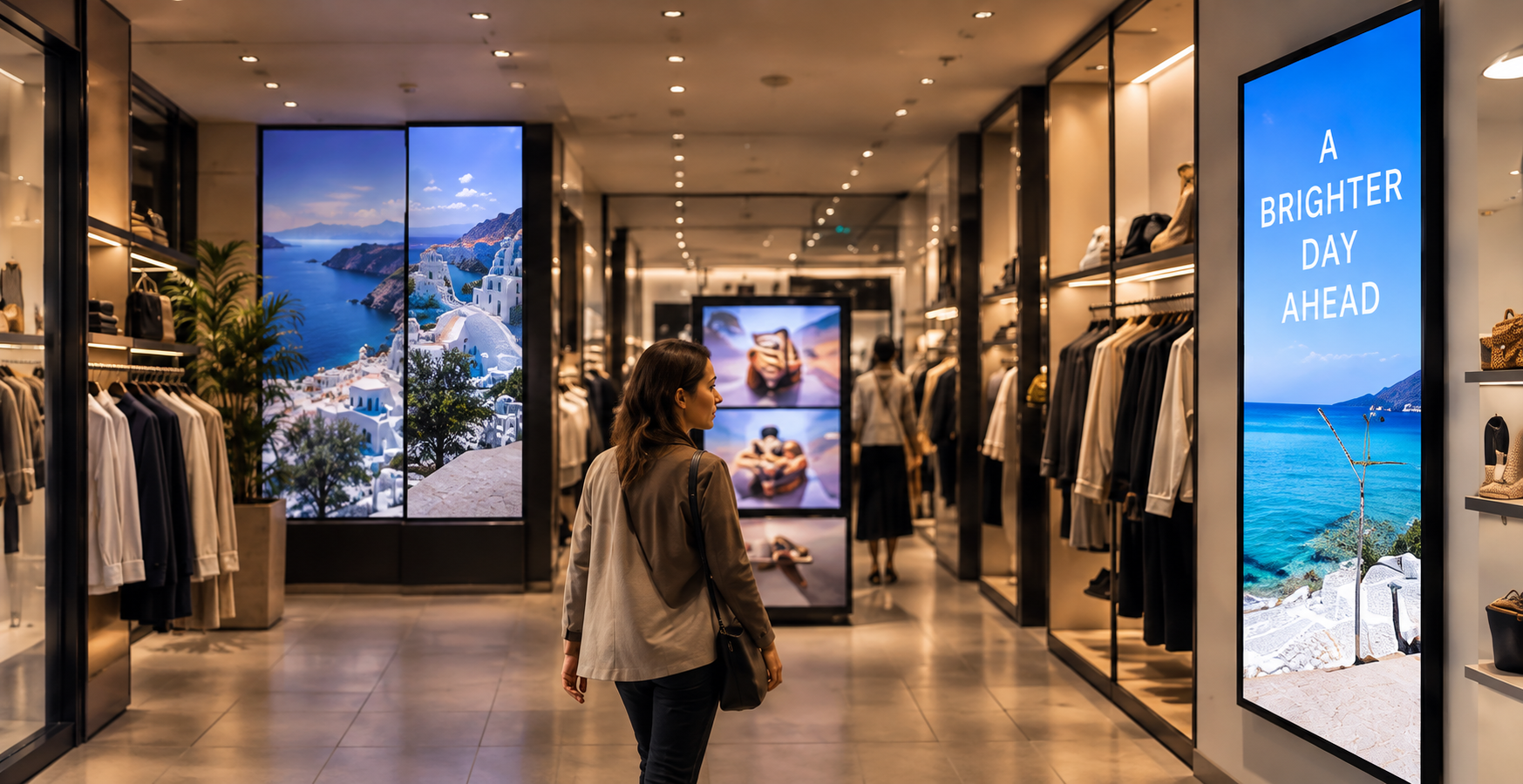
What counts as digital signage?
Digital signage is any screen that shows managed content to an audience: menus, schedules, announcements, wayfinding, promotions or live information. It can be a single screen at a counter or a network of displays across many locations. For a general definition, see the Digital signage overview on Wikipedia.
The examples below share one idea. Each screen answers a question the viewer already has, such as “What can I order?”, “Where do I go?”, “What’s happening today?” or “What should I do next?”
1. Restaurant and café menu boards
A digital menu board is probably the most familiar digital signage sample. Instead of a printed menu that has to be reprinted whenever something changes, the screen shows the current items and prices.
Why it’s easy to notice:
– Large product names with a short description
– One or two featured items instead of the whole menu at once
– Content that changes by time of day, for example breakfast, lunch and evening
Tip: Keep each slide to one purpose. A “today’s special” slide gets more attention when it sits on its own than when it is squeezed in beside forty other items.
2. Retail promotions and in-store displays
Shops use screens near entrances, shelves and checkouts to highlight offers, new arrivals and seasonal campaigns.
Why it works:
– It sits at the point of decision, where the customer is already choosing
– Motion draws the eye without needing more text
– Promotions can be switched on and off without a print run
Tip: A short headline, one image and one clear offer beat a crowded slide. If shoppers need more than a few seconds to understand it, simplify it.
3. Reception and lobby welcome screens
Offices, clinics, hotels and showrooms often use a screen at reception to greet visitors, show a company message, or list who is expected.
Why it works:
– Visitors wait in this spot, so they have time to read
– A welcome message with a name or logo sets a professional tone
– Practical details such as Wi-Fi instructions or opening hours reduce repeated questions
4. Wayfinding and directories
Large buildings such as malls, hospitals, campuses and business centers use digital directories to point people to the right floor, room or department.
Why it works:
– Arrows and floor labels remove guesswork
– Updates are simple when a tenant or room changes
– A consistent layout helps people learn it once and use it anywhere in the building
Tip: Use high contrast and large text. The W3C’s accessibility guidelines recommend a minimum contrast ratio of 4.5:1 for normal text (see WCAG 2.2, Contrast (Minimum)). It is a sensible baseline for any screen people read from a distance.
5. Internal communications for staff
Break rooms, warehouses, factory floors and back-of-house areas are good places for screens that show:
– Daily schedules and shift notes
– Safety reminders
– Team announcements and recognition
– Key figures or targets
Why it works: Staff who do not sit at a computer all day still see the message. A screen in a shared space can replace a noticeboard that nobody checks.
6. Events, conferences and venues
Event screens show session schedules, room changes, sponsor messages and social walls.
Why it works:
– Timing matters, and the screen can update as the day changes
– Rotating sponsor slides give each sponsor a fair share of airtime
– Attendees check schedules often, so the screen earns repeat attention
7. Queue and service-status screens
Banks, pharmacies, service centers and public offices use screens to show ticket numbers, counters and expected waiting information.
Why it works: The screen gives people something useful while they wait. This kind of example of digital signage also shows that a screen can be functional first and promotional second.
8. Education and campus screens
Schools and universities use screens for timetables, room allocations, notices, exam information and campus news.
Why it works: Information changes constantly, and students look for it on their way somewhere. A screen at a corridor junction or entrance reaches them at the right moment.
9. Transport and public information
Stations, stops and terminals display departures, delays and service notices. These are among the clearest digital signage examples because the content is live and viewers rely on it.
Why it works: The information is current, readable at a glance and relevant to the decision the viewer is about to make.
What these digital signage samples have in common
Looking across these examples, the screens that get noticed tend to follow the same few habits:
- One message per slide. Each slide has a single point.
- Short text. Headlines are readable from a distance, and details go elsewhere.
- Strong contrast and clear type. Text must stand out against the background.
- The right place. The screen is where people pause, queue or decide.
- Fresh content. Old information teaches people to ignore the screen.
- A clear next step. The viewer knows what to do: order, ask, go, scan or wait.
The screen is only half the job. The content decides whether anyone pays attention, so it is worth planning what you will show and how often it changes. Our guide to digital signage content covers that in more detail.
A quick checklist before you publish a screen
Use this list to review any digital signage example you are about to put on a display:
- [ ] Can someone understand the message in about three seconds?
- [ ] Is the text large enough for the viewing distance?
- [ ] Is there enough contrast between text and background?
- [ ] Is there only one main call to action?
- [ ] Is the content current, with no expired dates or old prices?
- [ ] Does the content suit the location and the people who pass by?
- [ ] Have you looked at the screen from where the audience actually stands?
Common mistakes to avoid
- Too much on one slide. A crowded layout is easy to ignore.
- Tiny text. What reads well on your laptop may be unreadable across a room.
- Never updating. A screen showing last month’s offer hurts credibility.
- Copying print layouts. A poster designed for close reading does not always work on a screen viewed at a glance.
- Ignoring the environment. Glare, lighting and viewing angle all affect how readable a screen is.
Choosing which example to start with
You do not need to build everything at once. Pick the one situation where a better message would help most:
- If customers ask the same questions repeatedly, start with an information or menu screen.
- If you want to promote specific products, start with a point-of-sale promotion.
- If staff miss announcements, start with an internal communications screen.
- If visitors get lost, start with wayfinding.
Test it, watch how people respond, and adjust. Small changes to wording, timing and placement often make the biggest difference.
Final thoughts
The best examples of digital signage are not the flashiest. They are the screens that show the right message, in the right place, at the right moment, in a form people can read in seconds. Use the examples above as a starting point, match them to a real question your audience has, and keep the content fresh.
Image suggestions with alt text
- Restaurant menu board:
Digital menu board in a café showing a featured special and three drink prices - Retail display:
Retail store screen near the entrance showing a single seasonal offer - Reception screen:
Welcome screen at an office reception displaying a greeting and Wi-Fi instructions - Wayfinding:
Digital directory in a building lobby with floor labels and arrows - Staff screen:
Internal communications screen in a break room showing the daily schedule - Checklist graphic:
Checklist for reviewing digital signage content before publishing
Leave a Reply